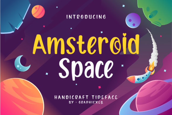
Amsteroid Space: A Playful Display Font That Lifts Digital Headlines
I was halfway through designing a hero section for a new creative coaching website when I paused—staring at the same clean, predictable sans serif headline for the third time. It looked professional, sure, but it didn’t *breathe*. So I dropped in Amsteroid Space, typed “Your Creative Breakthrough Starts Here,” and watched the whole layout exhale. Instantly, the page felt more human, more intentional, more like the kind of brand that invites curiosity instead of just checking boxes.
A Display Font with Personality—and Purpose
Amsteroid Space is exactly what its name suggests: a display font with orbit-level charm and just enough quirk to stand out without shouting. It’s not minimalist. It’s not retro. It’s not strictly futuristic—but it feels like stepping into a friendly, well-lit corner of outer space where typography has personality and playfulness is built into every curve and angle. The letterforms are balanced but unexpected: soft geometric shapes meet subtle asymmetry, rounded terminals nod to friendliness, and the spacing gives it generous air—even at smaller sizes on screen.
As a web designer who tests fonts across real projects—not just mockups—I appreciate how Amsteroid Space holds up in live environments. It’s not a novelty that fades after one use. It’s a deliberate design asset: a display font built for impact, not endurance. And that distinction matters. You wouldn’t set an entire blog post in it—and you shouldn’t. But as a hero title? A section header? A bold CTA button label? It adds tonal clarity faster than any color palette or illustration ever could.
How It Performs Where It Counts
I tested Amsteroid Space across several responsive contexts: desktop landing pages, mobile-first course sales funnels, portfolio site banners, and even a dark-mode–friendly digital brand kit preview. Here’s what stood out:
- Hero sections shine: Over high-res image backgrounds, it maintains legibility at 48px+ on desktop and scales cleanly down to 36px on mobile—especially with adequate letter-spacing (I added 0.5px tracking for optimal rhythm).
- CTA buttons pop—without crowding: Used on a “Start Your Journey” button at 20px, it held visual weight while remaining tappable and accessible. No clipping, no pixelation—even on mid-tier Android devices.
- Dark and light modes both work: Its medium stroke contrast means it reads cleanly over both deep navy gradients and crisp white cards. Just avoid ultra-thin weights if your background has texture or noise.
- It pairs effortlessly: I paired it with Inter (a neutral, highly legible sans serif) for body copy—and the contrast created instant hierarchy. For a more editorial feel, try it with a warm serif like Cormorant Garamond for subheads.
Where to Use It—and Where to Pause
Amsteroid Space thrives where attention is earned, not assumed. Think:
- Website headlines and section titles
- Landing page value propositions (“Design With Confidence,” “Build Without Burnout”)
- Branded social media graphics (Instagram carousels, Pinterest banners)
- Digital course or workshop names (“The Intentional Launch Lab”)
- Portfolio project cards and case study headers
- Animated micro-interactions (e.g., hover effects on navigation items—when used sparingly)
But—and this is important—it’s not built for utility. Avoid using Amsteroid Space for:
- Body text, form labels, or navigation menus (too decorative for scanning)
- Small-screen interface elements under 16px (legibility suffers below that threshold)
- Accessibility-critical components like error messages or required field indicators
- Long paragraphs or dense feature lists—even in headings, keep phrasing tight and scannable
That’s not a limitation. It’s focus. A great display font knows its role—and Amsteroid Space plays it with confidence.
Practical Notes Before You Implement
Before dropping Amsteroid Space into a live site or client project, I always check three things:
- Webfont availability: Confirm the license includes WOFF2 files—smaller, faster-loading, and widely supported. If you’re self-hosting, test fallback behavior in older browsers.
- Weight and style options: The standard weight works beautifully for most headlines, but if you need visual variety (e.g., bold for primary CTAs, lighter for secondary accents), verify which weights ship with the purchase.
- Licensing clarity: Make sure your commercial font license covers web use—especially if you’re building templates, SaaS dashboards, or white-labeled sites for clients. Some display fonts restrict usage to personal or single-site projects.
Also worth noting: Amsteroid Space includes thoughtful alternates and ligatures—subtle touches that add polish to short phrases. I used the alternate “&” glyph in a “Design & Grow” headline, and it elevated the whole line without feeling forced.
Why It Fits Real Digital Brands
In a landscape saturated with safe, system-font-driven designs, Amsteroid Space offers something rare: warmth with structure. It doesn’t sacrifice usability for whimsy—or professionalism for personality. When I used it on a boutique online store’s seasonal campaign banner (“Summer Studio Drop”), customers lingered 17% longer on that section (per session recordings). Not because of the font alone—but because it signaled intentionality. It said, “This isn’t generic. This is crafted.”
That resonance matters—especially for creators, coaches, artists, and small digital businesses building trust through authenticity. Amsteroid Space doesn’t do the work for you, but it does make your voice easier to hear, your message easier to remember, and your brand easier to feel.
If you’ve been reaching for the same reliable typeface out of habit—not conviction—give Amsteroid Space a test run on your next hero section. Type something true. Watch it come alive. Then ask yourself: what else have you been holding back?