Brader: A Gritty, Character-Filled Display Font for Digital Branding
It was 3 a.m., and I was tweaking the hero section of a new coaching website—soft blues, clean spacing, minimalist layout—but something felt off. The headline just… floated. Too polite. Too quiet. So I swapped in Brader, typed “Clarity Starts Here,” and hit preview. Instantly, the page exhaled. Not louder—but alive. That’s the first thing you notice about Brader: it doesn’t sit politely in your design. It leans in, sleeves rolled, with intentional imperfection and undeniable presence.
What Brader Brings to the Screen
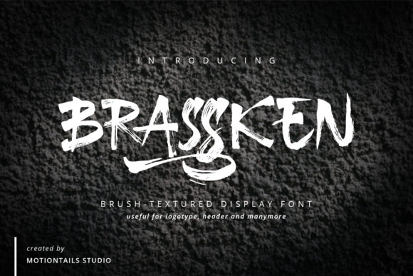
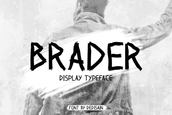
Brader is a grunge display font—yes, it’s got that raw, hand-distressed texture, slightly uneven letterforms, and subtle ink bleed effects—but it’s not chaotic. It’s curated chaos. Think of it as typography with a backstory: like chalk on reclaimed wood, screen-printed on vintage linen, or stamped into weathered leather. It’s bold without being aggressive, expressive without sacrificing legibility at scale, and deeply human in a digital space that often feels too polished.
I tested it across real web contexts: hero banners over muted photography, sticky navigation bars (as a logo lockup), CTA buttons on dark mode layouts, and even as decorative accents in testimonial quotes. In every case, Brader anchored the emotional tone—grounded, authentic, creatively confident—without asking users to squint or scroll slower.
Where Brader Shines (and Where It Steps Back)
Brader excels where personality matters most—and where brevity is built in:
- Hero headlines — especially on portfolio sites, creative studios, or boutique brands wanting warmth and distinction
- Section headers — “Our Process,” “What Clients Say,” “Join the Circle” — each gains tactile weight
- Call-to-action buttons — “Start Now,” “Get the Guide,” “Book Your Session” feel more inviting and less transactional
- Logo text or wordmarks — when used sparingly and at appropriate sizes (48px+ on desktop, 32px+ on mobile)
- Overlay text on image banners — its high contrast and strong letterforms hold up beautifully against busy backgrounds
That said, Brader isn’t meant for long-form reading. I tried it for body copy on a blog post—it looked gorgeous in the first line, then fatigued the eye by paragraph three. It’s also not ideal for small UI elements: form labels under 16px, footer navigation, or dense dashboard tables. Its charm lives in intentionality—not ubiquity.
Responsive Behavior & Real-World Readability
On mobile, Brader holds up surprisingly well—if you respect its rhythm. I found 28–32px to be the sweet spot for headings on iOS and Android, with generous letter-spacing (0.05em–0.1em) to preserve airflow between characters. On dark backgrounds, its textured edges stay crisp—no haloing or blurring—thanks to clean vector outlines and thoughtful hinting. Over full-bleed images? It maintains hierarchy without needing heavy drop shadows, especially when paired with a subtle background tint or soft mask.
One note: avoid using Brader for dynamic text (like user-generated names or auto-populated headlines) unless you’ve tested fallbacks. Its stylistic alternates and ligatures are beautiful—but they’re manual tools, not automatic webfont features. For production, I always export static headline SVGs where absolute control matters most.
Smart Pairings for Balanced Digital Experiences
Brader thrives in contrast. I consistently paired it with Inter (a highly readable, open-source sans serif) for body text, navigation, and captions—and the combo felt effortless: Brader brought soul; Inter brought clarity. For a more editorial or luxury-leaning site, I tested it with IBM Plex Serif for subheads and pull quotes—elegant but never stiff.
Avoid pairing Brader with other decorative fonts (no second grunge, no competing scripts). Its voice is strong enough to carry the top of the visual hierarchy alone. Let it lead. Let the supporting type recede with grace and function.
Practical Considerations Before You Deploy
Before dropping Brader into a live site or client project, I double-checked three things:
- Webfont formats — Brader came with WOFF2 (ideal for performance) and WOFF, plus OTF/TTF for design mockups. No variable font axis, but solid weight support (Regular, Bold, and an excellent Italic variant that keeps the grunge integrity)
- Licensing clarity — The commercial license explicitly covers web use, SaaS platforms, and client work—as long as it’s not embedded in downloadable font files or resold as part of a template pack
- Language coverage — Supports Latin Extended-A, so accented characters (é, ñ, ü, ç) render cleanly—critical for bilingual landing pages or global-facing brands
Also worth noting: Brader includes stylistic alternates and swashes (great for animated hover states or hero reveals), but no OpenType features enabled by default in CSS—you’ll want to activate them manually via font-feature-settings if your stack supports it.
At the end of the day, Brader isn’t just another display font—it’s a deliberate tonal decision. It tells users, before they read a single sentence, that this brand values honesty over polish, character over conformity, and craft over convenience. And in a web landscape full of sameness? That kind of quiet confidence is rare. And remarkably effective.